Thirsty For You BTS
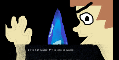
Edit: Labeled my devlog wrong because I got too excited.
HERE WE GO
As of now we have 3 downloads and 29 browser plays! Whoooop! (Is that good or bad?)
With that out of the way, here's the behind the scenes for the terrifyingly bad but beautiful Thirsty For You!
You might be wondering how Thirsty For You managed to be so inexplicably amazing and unique. You'd think that the worst visual novel is made that way out of pure carelessness or unintentionally like The Room. People made their worst visual novel through low effort, while I made mine with negative effort, we're not the same. Here's the journey behind the creation of the masterpiece.
AMAZING CUSTOM FONT
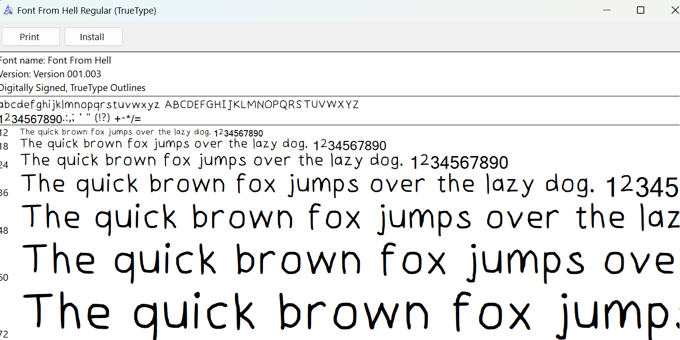
Yes I wrote the custom font in Paint (naturally), with my non dominant hand on a laptop. This is the font for the entire game. On the online platform I used (Calligraphr), I used the template with grey lines as a guide because I'm not that evil (and I'm trying to save time). Fun fact, I only drew letters for the alphabet, some punctuation marks and the number 2. If some symbols don't appear in the game, that's why.
Labels

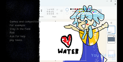
Note above: 'pay taxes' is only available in downloaded files and not when played in the browser.
Why are the default labels in renpy so beautiful? Because I randomized them 100 times in google translate as you should.
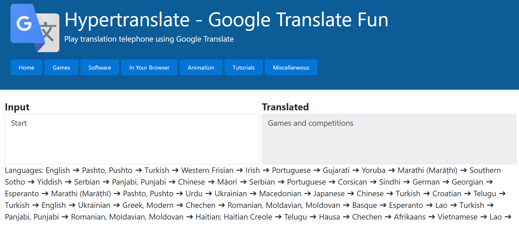
^ In case people are lost in the main menu, 'Games and competitions' is how you start the game.
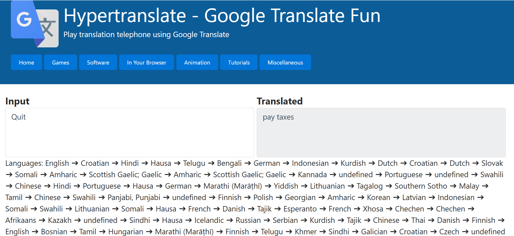
I laughed way too hard at this that I started coughing like crazy.
Let's acknowledge the other set of beautiful but underappreciated button labels at the bottom of the textbox:
And eggs - Back
the sky - History
Consumer insurance - Skip
etc. Mess around with the visual novel to find out!
Art
Made in Paint with my non-dominant hand on a laptop touch pad. This is the virgin Akua prototype vs the chad current refined in-game sprite.
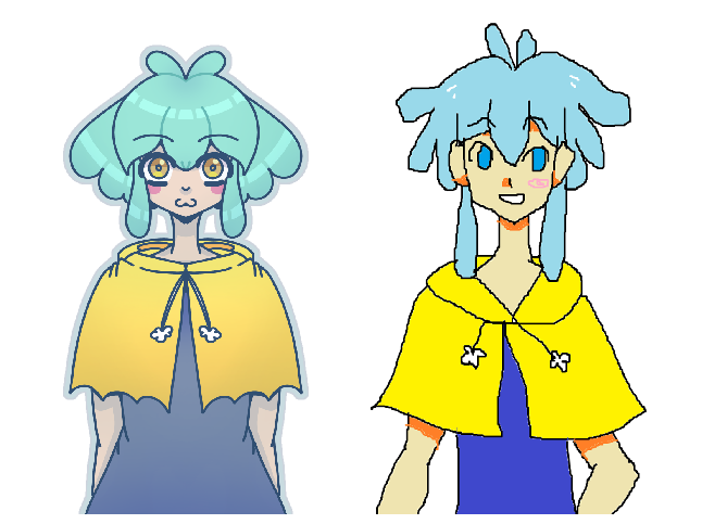
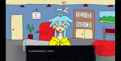
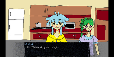
As you can see, Akua’s design and the VN’s art style has gone through quite a few design iterations. The smooth, boring brush style is replaced by the quirky pixelly lineart in the newer version that has a personality that its mom can't love. I’ve stuck to the default color palette in Paint, and the gorgeous saturated colours permeate this work. Akua’s design has been simplified from the constant water/rain motif in her prototype. Sometimes, her little cape poncho thing forgets its drawstrings, might vary and defy the basic laws of physics, but it adds whimsy into the work. As Picasso says, "It took me four years to paint like Raphael, but a lifetime to paint like a child." I manage the impossible and Paint like a fetus.
Soundtrack
I put that together. Pretty self-explanatory. The first song that plays is my first original music composition(?). I don’t know music theory and don’t play instruments aside from the ones they force you in music class.
Btw the track that plays the longest is called ‘annoying-birds’. People who have the misfortune of playing this are lucky that the construction noises stopped right as I was recording that. I’m still thinking of re-recording the track WITH construction sounds or going around to collect various construction and traffic sounds and stitch them together. Such a missed opportunity D:
Voice
Also me. Also self-explanatory. I’ve never voiced anything other than a school project many years ago. At the time, I ran out of the classroom because I hated hearing my voice, and now I had to hear myself make weird sounds while editing and insert my voice into the worst visual novel I can make. Amazing character development. Is this the start of my voice acting career?
For some reason, a voice file didn’t play while I’m testing it. It’s such a shame that me singing the chorus of Never Gonna Give You up (but the lyrics are ‘water’) won't be heard in the game.
GUI
Leaving it at the default settings is not enough. You know what it’s missing? Airbrush and crayon brush. I didn’t change everything because I got bored. Sorry for depriving my full graphic design prowess from the masses.
Writing and Characters
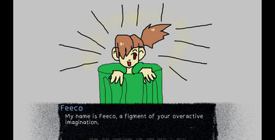
I winged it and went back to edit it by adding typos, misspellings and wrong character labels for extra flair. I took a lot of care to make the plot as unsatisfying as possible.
The writing part was tedious and the fact that I’m writing a bad story makes it so painful to get through because I didn’t know what to write next. You’d think that writing nonsense is easy, especially for someone like me, but I got bored of the story. 90% of this is meta jokes beaten to death and something about drinks. Pure trash. That's why I decided not to add the green wrench. I don't see anyone clamoring to fix THIS.
Conclusion
I genuinely had a lot of fun making Thirsty For You (outside of writing, but it has its moments). I've thought up of so many ways to make the reading experience worse, but I didn’t (like bright red font, a messier textbox, the whole thing about using construction site sounds to enhance the vibe).
At the very least, I wanted this thing’s shittiness to be accessible (Yes, this comes from someone who made their main menu labels go through google translate x100 purgatory). If it goes too far and the player rage quits, no one will be able to get the whole, unsatisfying experience. It won’t be the worst visual novel if there aren’t any committed players, after all.
To the brave warriors who have played this, I salute you! And don't forget to pay taxes!
Files
Get Thirsty For You
Thirsty For You
Hydration is important. Let's worship water together!
| Status | Released |
| Author | flufffables |
| Genre | Visual Novel, Interactive Fiction |
| Tags | bad, Creative, Cute, Funny, Kinetic Novel, My First Game Jam, Ren'Py, storygame, weird |
More posts
- Thirsty For You Gets A 1 Star Rating!Jul 08, 2024

Leave a comment
Log in with itch.io to leave a comment.